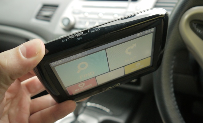
I’ve been testing a new satnav unit over the past couple of weeks – a Mio Spirit 485. It’s easy to find this unit for sale online at just under £80, and it offers a lot of features for the cash. There’s a 4.3-inch screen that’s bright enough to be visible on sunny days, attentive spoken guidance with street names and landmarks, and real-time traffic alerts, all in a light 150-gram package.
There are drawbacks, of course, as you’d expect for such a keen price. The guidance voice and the speaker it buzzes out of aren’t great, for example. The simulated female sounds as if she’s called in via satellite phone with a mouthful of marbles. As long as you don’t mind “Brighton” coming out as a choppy “Pry Den”, it’s fine.
At least the hardware feels nicely put together for the price. The light and relatively slim handset is no bother carried in a jacket pocket, and indeed there’s an option for guidance on foot. The car cradle suckers solidly to the windscreen and features a clever attempt to make a cheap docking-station out of a standard mini USB power connector. The USB plug slides into a recess in the cradle, meaning you can slot the unit in and out of its cradle without having to fiddle with the cable. Well, I say you can slot it in and out, what I mean is you can push it home or tug it free – unfortunately it doesn’t slide too easily, but the setup is a welcome innovation nonetheless.

The casing features just a single hardware control, a three-way switch featuring on, off and reset positions. It’s a little too easy to choose reset for my liking, which leads to an annoyingly extended boot-up sequence. Normal switch-on is admirably quick, though, and I had no trouble achieving a prompt satellite fix during my tests.
Out of the box the unit will sound chimes to warn of speed cameras, and will bong persistently if you keep going at more than 3mph beyond its record of the local speed limit. There are options to switch both off, or to raise the alert threshold to 7mph. An onscreen roundel keeps you abreast of the speed limit, and again this can be readily removed if you prefer.
The menu structure is clear and easy to guess your way through without resort to the manual. The screen lets you tap controls or touch and slide things, but it does require a reasonably firm finger. Getting back to the menu from the map screen is straightforward – simply tap the centre of the screen and it will bring up five of the most likely options plus a link back to the main menu.

Guidance uses TomTom’s IQ Routes software so is generally pretty good at finding its way around. One or two postcodes that ought to have been present did seem to be missing from the Mio – including my home postcode. I had no issue with the recalculation speed when I took shortcuts through the local London traffic, though.
The default map display is a “3D” scrolling perspective view, drawn in a colour scheme that automatically flips between night and day colours. Various settings allow you to tweak the map to your liking – you can switch to a 2D plan view, choose from seven different colour schemes, and instruct the unit to stay in either night or day mode if you wish. The default colour scheme – called Malmö – makes it very clear which road you should be on but shows surrounding roads in very low contrast. I preferred the alternative Genève setting, which felt better for picking out the right route at complex junctions.
Routes can be calculated with different biases – you can set the Mio to find the fastest, most economical, simplest or shortest routes when it scours the map. Sadly there’s no option to compare the routes and pick which you want as you set off.

Another annoyance is a familiar Mio foible. You can easily choose which key fact you’d like to monitor while travelling using a drop-down menu offering time-to-goal, distance-to-goal, ETA, or current speed, but you can’t persuade the screen to show all of them all of the time, which is what I’d like. The screen is big enough, but the software won’t have it.
Upcoming junction information is shown very clearly across the top of the screen, and at major route junctions the map view is replaced with a simplified diagram showing which lanes to take, complete with accurate replicas of the overhead road-signs.
My various grumbles aside, the Mio Spirit 485 is actually a very decent product that strikes a good balance among features, quality and price.
With UK and Ireland maps the 485’s recommended retail price is a penny under £100 but it can be found for £20 or so less online. A version without real-time traffic data, the Mio Spirit 480, has a £20 cheaper list price but doesn’t seem to attract the same discounts, so is probably best avoided. Additional maps can be downloaded and purchased outright or licensed for short periods. A full map of Europe costs £60 or can be “rented” for a month for £20.
If what you want is reliable guidance and a good-sized screen for well under £100, the Mio Spirit 485 seems like an excellent option to me.
Mio Spirit 485 satnav review
4 May 2012
Read more about: satnav


