I’ve used a Mio satellite navigation unit before – albeit briefly – back in April. While I was impressed with the Mio Spirit 500, particularly with what it offered for the money, there were some areas that felt ripe for improvement.
Even a quick poke around the newer Mio Navman Spirit 470 shows the engineering elves have been very busy.
The most annoying shortcomings of the earlier model were twofold: a weedy, inadequate speaker and a clumsy process for entering destinations by street address. Happily, both issues are fixed in the Mio 470.
Spoken directions are now much more distinct, without any fuzz or buzz at high volume levels. The generated voice does still tend to say what it sees when it comes to street names, though, and its attempts at the peculiarities of English pronunciation can occasionally seem very odd.
Setting a destination address is suitably straightforward in the Mio 470, with the software first asking for the town or city to narrow the subsequent search for a street name. The on-screen keyboard narrows your choices as you type to help you enter only valid names. The older unit, by contrast, took the rather cavalier approach of asking for a street name first, building a very long list of corresponding streets, and then expecting you to scroll down and pick the right one. This was no fun if you happened to be heading for the High Street in Yeovil, say.

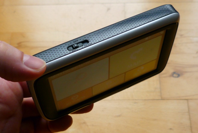
The new unit itself is very light at just 150 grams, yet looks sturdy enough to survive the odd drop. There are no buttons on the case except for the on-off-reset slider on the top edge, nor is there a battery-state LED or expansion slot.
Charging is via a mini-USB socket on the bottom edge – the unit ships with a flat battery and must be plugged in, either to your car or your computer, for a few minutes before you can step through the setup routine. My test unit asked for a code printed on the side of the packaging on first awakening, but thankfully didn’t need the code again after a reset.
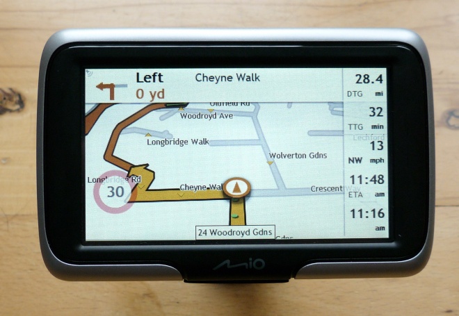
On the road, the 4.3-inch screen displays the usual scrolling map, zoomed out or in according to current speed. In the default colour scheme, the contrast between the guided route and other roads has been improved to aid clarity. The spoken directions are delivered in good time and you can navigate quite accurately without looking at the screen. Well, most of the time.
On one of my test runs I was surprised to hear an instruction to turn left at a McDonalds restaurant. For a moment I thought that Mio must have sold a product-placement deal to the golden-arched purveyor of fried food, but on closer inspection it seems that the directions have simply been integrated with the points-of-interest database, which contains the names of lots of different high-street brands.
While it’s a nice idea to include urban landmarks in directions, the POI database is not quite as accurate as it needs to be for this purpose. In the awkward real world, the McDonalds in question sat a full block away from the position marked on the map. If I’d followed the voice instruction I’d have taken a wrong turn.

While you might occasionally end up on the wrong road, there’s no excuse for getting a speeding ticket when using the Mio Spirit 470. It announces known speed cameras with a fanfare, and always shows the speed limit of the current road in a red-circled roundel. If you’re well within the speed limit this roundel fades into near transparency, but as you near the limit or go over, it becomes more intensely painted on the screen and more noticeable.
As well as current speed the screen will also display time-to-goal, distance-to-goal and estimated arrival time. By default, it will show only one of these measures in the top-right corner of the screen. Pressing this area will drop down a full list of options, and pressing a particular item will close the list while setting your choice at top right. It’s a handy way to prioritise information, but I’d prefer it if the full list could be set to stay on screen permanently. It tends to disappear of its own accord after a while.
Upcoming junction information is shown across the top of the screen, and at major route junctions the map view is replaced with a simplified diagram showing which lanes to take, complete with replicas of the overhead road-signs.
Delving into the settings, the most likely configuration you might want to alter is the default for route planning. There are three options: fastest, easiest and most economical. There’s no shortest-route option, which will be a loss to almost nobody who’s ever tried following the shortest route for more than a few miles across the British countryside.
Initial route planning felt reasonably quick, while recalculation if you stray off the right path is OK. There were times in my tests in the maze of Central London streets where I had to slow down and wait to learn which way to turn at an upcoming crossroads, but that’s hardly unusual.
This Mio model uses TomTom’s IQ Routes algorithm for calculating the optimum route. Like all satnavs I’ve tried so far, the route tends to be a bit ropey in Central London, all too often including right turns where the road signs dictate otherwise. It did eventually get me to all of the awkward destinations I tried, though.
The 470 model manages without real-time traffic data, a consequence of the unit’s low retail price. To add this useful facility, you’ll need to find a few more quid for the Mio Spirit 475. Ferret around online and you’ll find the 470 model with European maps on sale for around £90. The 475 model is typically about £40 more.
I’m not so sure about the more expensive model, but for the price, the Mio Spirit 470 I tested feels like a bit of a bargain to me.
Mio Navman Spirit 470 satnav review
30 November 2010
Read more about: satnav


